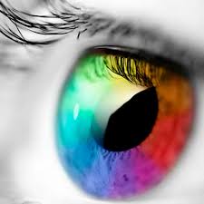
Meaning behind the colors and how to choose the right color
Meaning behind the colors and how to choose the right color:
Martin says Christie’s, the famous London designer logos, “Understanding the psychology of Alolon is a very important thing when designing a successful logo.”
Choose colors in the design is one of the most important design steps. The human mind responds dramatically visual indicators, and is considered one the color of the main factors in determining this response. Each color carries many meanings around it, so you must know the meanings of colors and their meanings and principles and then learn how you can apply these principles in the design of the logo.
Colors able to be messages and objectives of the design, as each color has an effect either negative or Ajaba If you do not improve the choice of colors will your design fails even if it did the opposite connect you to choose the right colors to suit the purpose of the design Vanma will become attractive and very ideal design. So let your success as a designer logo will be supported and strengthened if you have a thorough understanding of the psychology of colors.
What are the meanings of the colors?
All Alalon, including black and white, have an impact on the design of the logo. As a designer you need to choose colors carefully to improve specific elements of the logo and is working to clarify the Inquiry by choosing the right color and tone.
In general, the bright colors and bold attention-grabbing dramatically but can appear a bit reckless, and faded colors convey a more complex and sophisticated image, leading sometimes overlook viewed.
Red: a color of nature, warm color, and expresses this color for passion, danger or aggression, courage and excitement, as was the red color known to be a catalyst for the appetite, and therefore it is used in many of the slogans of restaurants and food products. Choosing the color red for your logo makes it racy and movement.
Orange: A lot of people see that orange is the color of creativity, innovation and modern thinking. This color also carries the meaning of youth, fun, joy and the ability to access and endurance.
Yellow: the designer must be careful when using it for the yellow color in the design of logos, because it carries some negative connotations, including the significance of cowardice and deceit and use it in the warning signals. Beyond that, the color yellow is associated with happiness and sunshine and demonstrates the hope and optimism.
Green: is the color of nature, beauty, tranquility, trust, honesty, optimism and patience, and also expresses the activity, precision and emotion. This vital color often used by organic food companies and plant and also in skin care to refer to natural ingredients products.
Blue: is one of the most commonly used by corporations colors, it carries with it the meaning of professionalism, seriousness, honesty, sincerity and calm, and is associated with the blue color of authority and success, and for this reason it is used by financial institutions, government agencies and major corporations.
Violet: It is a royal color, it shows that luxury and sophistication. It has long been associated with the church violet color, which shows the wisdom and dignity, and has historically held this color the meaning of wealth and good deeds.
Black: This color carries a double meaning, on the positive side, usually associated with power, elegance, and on the negative side, it can be associated with evil, death and mystery. Most designers tend to use black color in logos bold monochrome.
White: Generally associated with purity, cleanliness, simplicity and naive. Many companies choose to have a color copy of the logo and another version white. For example: the word Coke in the company’s logo appears in white on a red Coca-Cola cans and bottles infrastructure, while can be a word in red when used on a white background.
Brown: This color has connotations potency, and is usually used for products relating to rural life and outdoor.
Choose one color gives you more control over what people will watch in your logo, and on top of that you can also use it as a private brand strategy Bk.ouma over time people will start linking color with your brand. But nevertheless, there are some successful globally and logos that use multiple colors such as Google, windows, eBay which shows that these companies offer a wide range of products and services. For further clarification, the five Olympic rings logo multi prematurely assume the meaning of diversity and inclusiveness.
Designers slogans recently started using mosaic patterns in the design of logos, which requires a course to use several colors ranging from bright contrasting colors to reach the different gradients of color per share.
If the client that you design a logo it is a global company, you have to choose the logo colors very carefully. There are cultural differences in the way the interpretation of colors. For example, the red color carries meaning of luck in China, while considered the color of death and mourning in India. You should take these differences into account when designing your logo.
Ultimately, you do not have to put a lot of emphasis on the choice of color, many of the people suffering from color blindness, in addition to that there is always the possibility that the logo that you you design the client can make a copy of it in one color or even different colors, the client’s right to be used color that is he wants. So make sure you choose the color that enhances and supports logo design, but does not determine his identity.


